初中级前端工程必须掌握的CSS基础知识——布局。
话题起源
 1
 2
 3
 4
 5
 6
 7
 8
 9
10
11
12
|
.wrapper-flex {
    display: flex;
    align-items: flex-start;
}

.wrapper-flex .left {
    flex: 0 0 auto;
}

.wrapper-flex .right {
    flex: 1 1 auto;
}
|
创建flex布局
元素设置display: flex; 或者 display: inline-flex;
属性
| 作用在flex容器上 |
作用在flex子项上 |
| flex-direction |
order |
| flex-wrap |
flex-grow |
| flex-flow |
flex-shrink |
| justify-content |
flex-basis |
| align-items |
flex |
| align-content |
align-self |
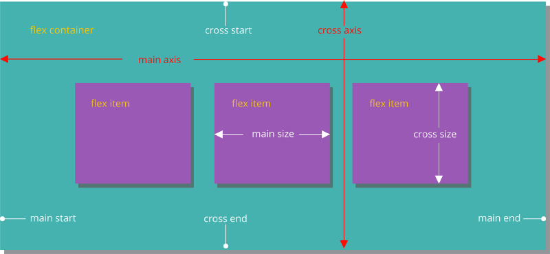
flex容器默认有两根轴,主轴和侧轴,默认情况下主轴为水平分布,但可以通过flex-direction来改变主侧轴的分布方向。
1
|
flex-direction: row | row-reverse | column | column-reverse;/*显示为行|行反向|显示为列|反向*/
|
1
|
flex-wrap: nowrap | wrap | wrap-reverse; /*不换行|换行|换行到上方*/
|
1
|
justify-content: flex-start | flex-end | center | space-between | space-around | space-evenly; /*水平方向子项的分布:左对齐|右对齐|居中|两端对齐|边缘空白相等|子项等间距*/
|
1
2
|
align-items: stretch | flex-start | flex-end | center | baseline;
/*拉伸|顶部对齐|底部对齐|垂直居中|第一行文字基线对齐*/
|
1
|
align-content: stretch | flex-start | flex-end | center | space-between | space-around | space-evenly; /*多行对齐方式:拉伸|顶部堆放|底部堆放|整体垂直居中|上下两端对齐|两侧间隔相等|上下等分*/
|
1
|
order: -1 | 0 | 1; /*整数值:该子项在最前面|默认|最后面*/
|
1
|
flex-grow: 0.5| 1 | 2; /*正数:扩展剩余空间总量的一半|剩余空间|同1*/
|
1
|
flex-shrink: <number>; /* 单个元素收缩比例,数值,默认值是 1 */
|
1
2
|
align-self: auto | flex-start | flex-end | center | baseline | stretch;
/*子项的垂直对齐方式*/
|
参考资料
flex在线练习小游戏
写给自己看的display: flex布局教程
写在结尾
昨天和timing的前端面试官聊了半小时左右,发现一些前端基础忘得差不多,写几篇博客学习和巩固。